Verb - Responsive Design w/ data
Creating a Web-Responsive Layout and Design


User Type
Skill(s)
Industry
Date
Date
Direct Sales Person(s)
UX/UI Design
Sales (Varying Markets)
January 2022
Problem
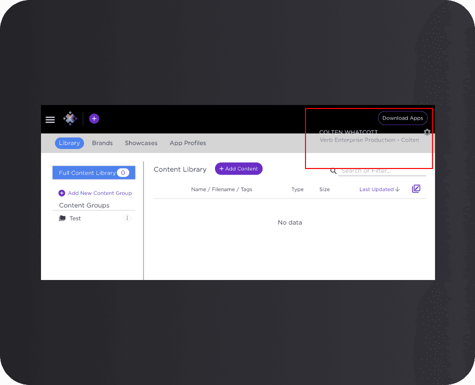


Verb's website was not built to be web-responsive, so we set out to change the functionality of the site. (I was unable to capture an image of the pre-web-responsive site due to the creation of the use case at a later time.)
Verb's website was not built to be web-responsive, so we set out to change the functionality of the site. (I was unable to capture an image of the pre-web-responsive site due to the creation of the use case at a later time.)
Requirements
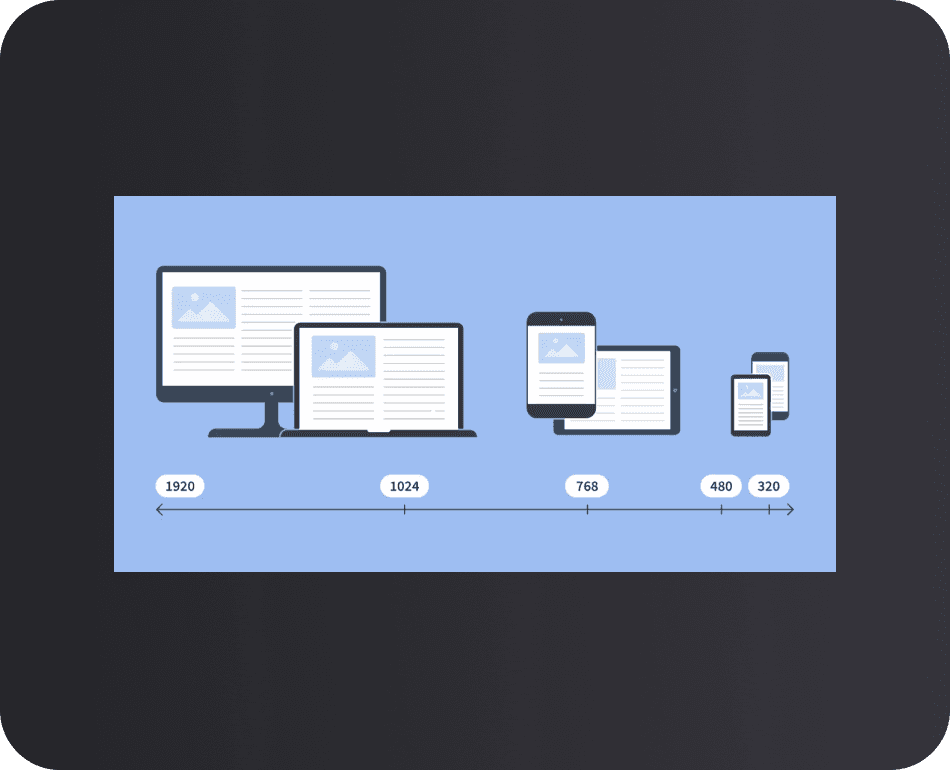


Define breakpoints
Update UI to match new Design System
Heavy dataset visuals
Solve data visualization on mobile
Define breakpoints
Update UI to match new Design System
Heavy dataset visuals
Solve data visualization on mobile
Ideation & Research
After researching and brainstorming with other designers and project managers, we came across a potential solution to displaying large data sets on the mobile breakpoint.
Credit John Winter via Medium: https://uxdesign.cc/designing-a-complex-table-for-mobile-consumption-nom-7472f7b11fe6
After researching and brainstorming with other designers and project managers, we came across a potential solution to displaying large data sets on the mobile breakpoint.
Credit John Winter via Medium: https://uxdesign.cc/designing-a-complex-table-for-mobile-consumption-nom-7472f7b11fe6
Aligning Data Points
When deciding which data points to view, the user has two options to consider:
1 - A single column of data laid out in multiple rows
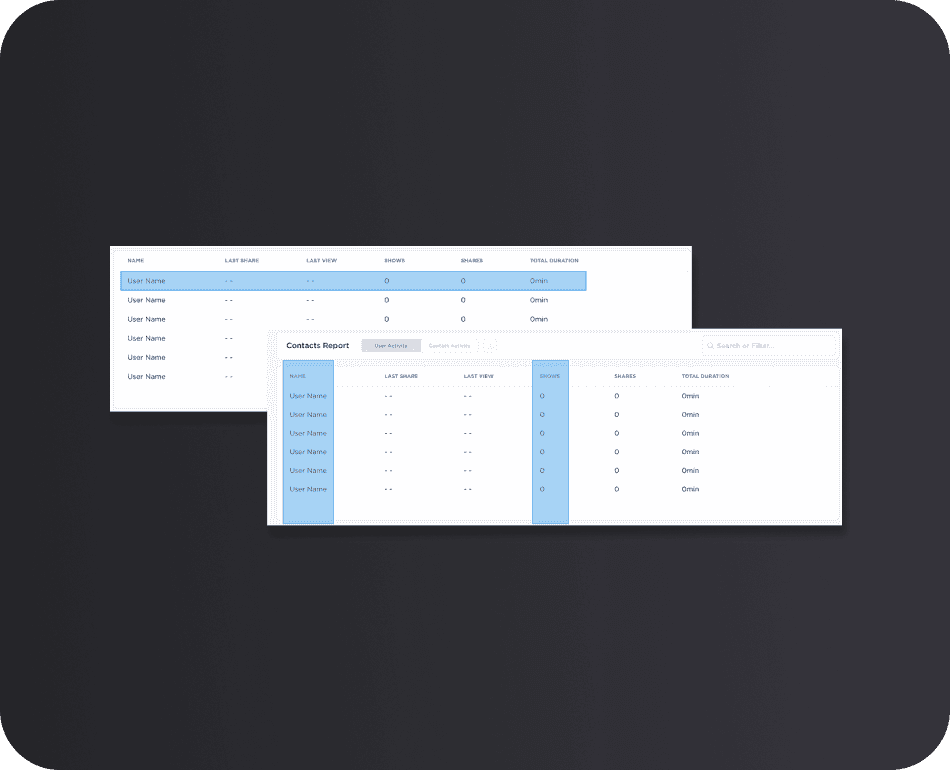


2 - A single row of data laid out in multiple columns
Solution
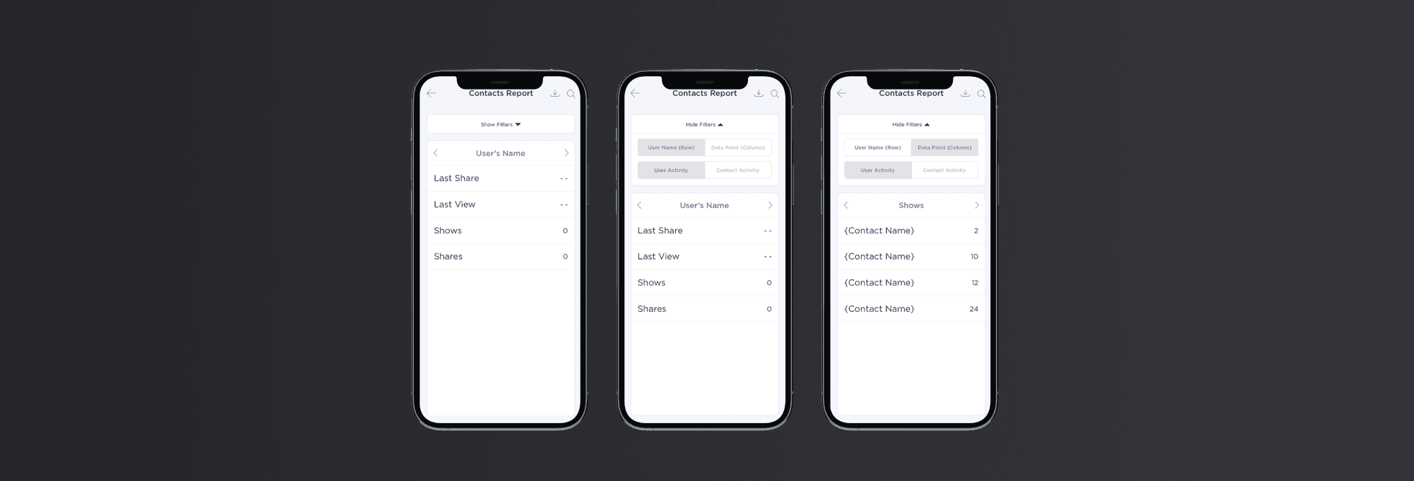
This solution creates the best experience for the user by still being able to view all of the data points while having the constraint of being on a mobile device with clearly not the real estate needed to view the entire data table. Having to scroll horizontally is not a good experience on mobile for both screen space and keeping the context connected between data points.
This solution creates the best experience for the user by still being able to view all of the data points while having the constraint of being on a mobile device with clearly not the real estate needed to view the entire data table. Having to scroll horizontally is not a good experience on mobile for both screen space and keeping the context connected between data points.


User Type
Direct Sales Person(s)
Skill(s)
UX/UI Design
Industry
Sales (Varying Markets)
Date
October 2022